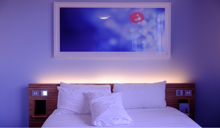
Art adds life to your home’s interior and defines your personal style. Whether it’s an expensive painting you bought in a gallery or your own artwork, everything deserves to be showcased in your home gallery. However, before hanging an art piece on the wall, think about the background, the wall, and its paint color.
Your wall color is as important as the frame of the art piece. This should not disturb the masterpiece, but it should complement the art as one instead. You’ve devoted considerable thought to picking and organizing your art pieces. In that case, it only makes sense to provide the same amount of thought to selecting a fantastic color for your interior painting.
HOW TO CHOOSE THE BEST WALL COLOR TO GO WITH YOUR ART
1. Consider your Preferences
Before hanging any art piece on your interior walls, it’s crucial to think about the direction and theme of your design. Think about what you want a room to look like when everything’s done.
Evaluate your preferences, whether you want a peaceful or cozy vibe. Or you want your space to look more elegant, bright, clean, formal, or something dramatic. Whichever path you take will assist you in determining the suitable color scheme to match your art pieces and wall color.
A calm environment, for example, would require darker and cooler colors like greens, blues, and purples. A mix of neutrals and gentler, lighter tones could be used in a more brilliant and simple design. And how about some drama? Choose brighter, warmer shades like magenta or red.
2. Identify Your Wall Paint’s Undertone
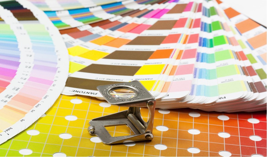
The shade of your interior walls may appear clear to you but take a deeper look. Unless the paint color of your wall is pure white, there will almost certainly be some undertones that will alter your entire color palette. All paint colors contain undertones, including grays, beiges, and whites. The problem is that these “concealed” hues are difficult to notice unless you compare your wall paint to a different shade.
That’s why having a paint color fan deck for color comparisons comes in handy. If your interior wall color is eggshell, cream, ivory, or another neutral white, choose the purest white on the fan deck to detect undertones. Likewise, compare your wall to other shades of blue, beige, or gray to get a sense of the fine undertones affecting the dominant hue.
Matching the color palette of your artworks with the undertone of your wall helps ensure that nothing appears strangely “wrong” when everything is put together.
3. Choose a Color Scheme
Here are some useful design ideas to consider — and when you’ll need to pull out your color wheel. When it comes to the type of color scheme that will bind your room together, you have three options: monochromatic, complementary, or analogous.
Let’s have a look at what each of these represents.
Monochromatic
Become one with your color palette. A monochromatic design creates a unified, harmonious aesthetic in your space by using only one color in various shades. Choose a few distinct tones, shades, or tints of the same color to incorporate in your artwork based on the color of your wall (or undertone).
Complementary
Do you want to make a bigger statement with your art? Then you should go with a complementary color palette. Complementary hues, such as green and purple or orange and blue, are opposite each other on the color wheel. Combining complementary shades produces a striking contrast and adds interest to the space.
If your wall paint color is neutral, consider the undertone to determine which complementary color to choose. If your wall already has a specific hue, simply locate its inverse on the color wheel!
Analogous
Analogous colors are those that are adjacent on the color wheel. Using tones of the same color will result in a more peaceful and harmonious effect between your hanging art and wall color.
Choose one dominating color and apply the remaining two or three as accent colors. If your wall paint color is neutral, start your analogous color scheme with the undertone of the wall. For example, if your wall color has a light-blue undertone, your accent colors could be soft green and navy blue.
BEST WALL PAINT COLORS FOR HANGING AN ART PIECE
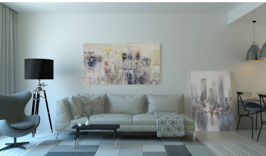
Neutral Colors
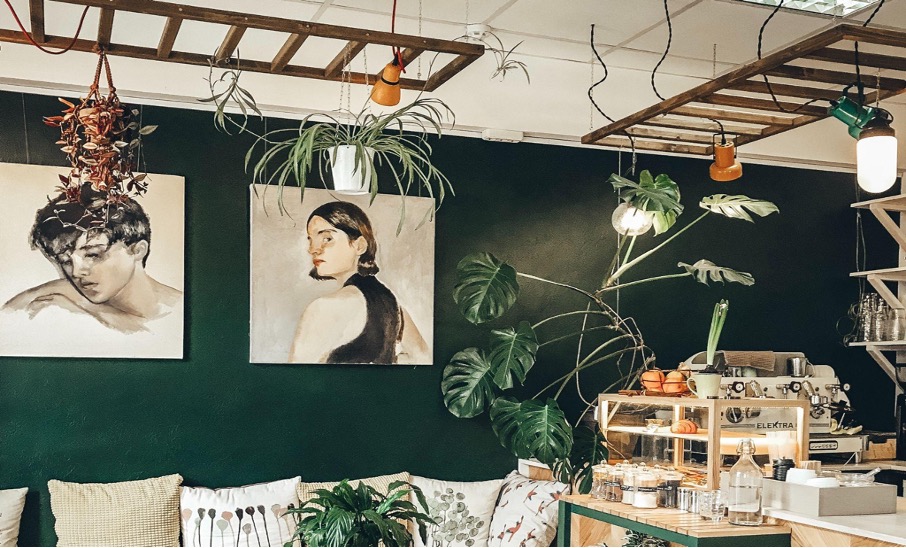
You can never go wrong with hanging your paintings on a neutral-colored wall. Choose a darker color, such as dark bluish-gray, to create a dramatic space.
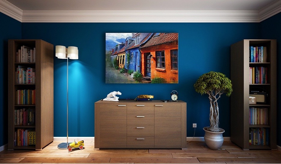
Sky Blue
A sky blue wall contrasts nicely with predominantly white art pieces. Both the art and the wall color have an ethereal appearance, giving a tranquil and dreamy vibe to the area.
Olive Green
Olive green walls are a perfect complement for retro-inspired spaces with classic artworks and accessories. The color definitely brings the 1960s and 1970s vibe.
Lavender blue
Choose a wall paint color that will mask your frames for a uniform design. For example, the pale lavender wall paint color will fit well in with silver-framed artworks, putting more emphasis on each block of color.
Pink-Orange
If your artwork has vibrant colors, don’t assume your wall color needs to be as vivid. Softer and more subdued paint colors will highlight your piece while downplaying the rest of the space. A vivid coral or Pink-Orange background is appropriate for artwork with subdued hues. Color tones that contrast add balance and interest to a room.
Yellow
A photo display complements the white elements in a space. With so much white, a bold yellow wall color makes the artwork and furnishings stand out without overpowering the space.
Terracotta
Photographs in black and white stand out nicely against a deep wall backdrop. For example, terracotta-colored walls complement gray or black-and-white artwork.
CONCLUSION
It’s important to consider the color, size, and type of art pieces you will hang on your wall before starting your interior painting project.
You can always go back to the tips and list of colors above if you’re still unsure about what color you’re using.
However, if you’re having a hard time deciding which wall paint color suits best for your artwork, don’t hesitate to call the most reliable painting contractor in your area. By doing this, you can ensure that you’ll get professional help and the best result for your project.
About the author: Jericho Miles is a copywriter and content creator of Custom Colonial Painting that specializes in architectural, landscaping, and construction-related blogs. He’s drawing his writing inspiration from his experiences as a junior architect.