
By Michael Pacitti
Color trends reflect how we live our lives, and our outlook on color has broadened thanks to today’s new technology. Simultaneously, our boundaries between public life and private life have blurred, and our take on privacy has evolved. Some people desire to create a personal territory, away from the hustle and bustle of our world. Our age-old desire is to take shelter and find that peaceful inner space. Within the comforts of our home, we respond to a need for privacy. Color helps us abound in our nest.
The home also takes center stage when it comes to color trends and decoration. Original art, canvas transfers and Giclée are growing to fill large loft walls or high ceiling entrances. Mirrors are also welcome additions throughout the home. Traditional styling has merged with modern designs to produce a new “transitional” look.
We now live in a time more focused on natural environment, fresh eating and healthy living. Citrus and farm-fresh colors of vegetables, fruits and open fields help illustrate our way of life. Some colors have become more weathered and washed, as though they have worn down over the years, making our spaces feel lived-in and comfortable. Paint companies curate new neutral color palettes each year to help you find and create those moments of sanctuary in your home.
By staying on top of changing color trends, framers can harness color fads and boost their business.
A Colorful History
The human eye can see approximately seven million colors, many of which affect the viewer’s mood and health. When naming colors, people rely on cultural conventions. Some cultures have a few names for all colors; others have dozens or hundreds of names. We learn to name colors the same way we learn to name animals, foods or letters of the alphabet: We look, someone else points and names, and after a while we get the connection.
Color trends have changed dramatically throughout the decades. In 1917 Evercote House Paint released one of the first color-trend forecasts for home interiors and exteriors. This practice continued for years and included paint for trend periods such as Victorian, Colonial, Jacobean and Art Deco. The original forecasts for interior and exterior home color came from paint companies. Today, paint companies such as Benjamin Moore, Pantone and Dulux still continue to track the color trends.
Consumers drive color trends. A color cannot be a trend unless it sells. A color does not change; the consumer’s attitude toward a color changes. Several factors will affect the trend including lifestyles and social changes, political events, travel, art, social media, music and cultural and global events.
A significant global event, such as World War II, can greatly affect the direction that colors take in the ensuing years. Like the battlefields, the color trends during that war were drab, full of khakis, heavy grays, somber teals and thick reds.
New color trends can show up in a matter of months after a major event. In 2010, Pantone predicted the popularity of the color turquoise. That year Twitter released a new turquoise logo, and the Vancouver Winter Olympic Games used turquoise as the background color for the Games’ website, which received more than 1.5 billion hits. Hollywood also released the hit movie Avatar and released a live-action version of Alice in Wonderland, both of which use turquoise in many of the backdrops and color schemes.
Each year Pantone and other organizations also forecast the year’s top wedding color, which often links to a current fashion statement. “Radiant orchid,” 2014’s color, is abundant in this year’s wedding palettes as decorative trims, accents, centerpieces and bouquets.
Boost the Business
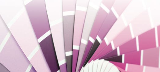
Today’s color trends adapt diverse design influenced by individual color selection. Custom picture framing designers can choose color though matting and moulding to fulfil customers’ desires. Framers should understand the tint, tone and shade factors in any combination of selected colors or schemes.
Keeping in tune with the latest images, such as trend posters and art, will also help framers know what colors are hot and what moulding to use in a framing combination. For example, movie posters from the ’70s and ’80s, with their heavy use of primary colors, are now fashionable additions to home decor.. Red, blue and yellow mouldings and mat boards, such as Crescent Cardboard’s Brite Cores, are well-suited for these posters.
Color trends appear to develop at a fast pace, in and out within a year. Separate and identify mat boards in trend colors to identify yourself as a custom framing designer aware of the current trends.
Michael Pacitti is publisher of DECOR magazine and Show Director for DECOR Expo Showcase. He has worked in the interior design, art, photography and custom framing design industry for more than 25 years.
Sidebar:
Color Tools
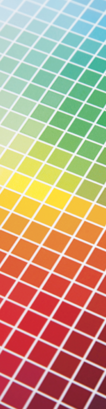
Websites such as colorhunter.com and pictaculous.com extract all of the colors in an image or picture to produce a color palette for color design and assessment. They are great tools for solving matting issues that require the breakdown of an image by color distribution. These free sites will help you upload an image, instantly send back the color distribution and, in some cases, show the most predominant color.