
By Tara Crichton
Historically, spring is my favorite time of year. I say “historically” because this seems like the spring-that-wasn’t. Fall got co-opted by winter and spring has gotten bullied into submission, too. My personal response has been to revolt against the grey by bringing as much color into my personal space as possible. I brought the essence of spring into my life with décor accents redolent with gorgeous tints of salmon pink, the blue of Caribbean water, and the green of freshly sprung bulb sprouts. None of these are colors I have ever considered being in my palette. I’ve always preferred neutrals.
This year I’ve gotten thoroughly saturated with neutrals and want to kick them back into the closet with my heavy winter coat. One of the joys of this human existence is our infinite capacity for change. We change our tastes, our preferences and our minds all the time. Don’t assume that your custom-framing customers are any different than yourself.
Custom-framing customers always come into the custom-framing shop carrying their art and a preconceived notion of “what they want.” This is not a bad thing. But this doesn’t mean that you should let them have what they think they want either. This first exchange of ideas is a necessary base on which you build your final masterpiece. It is a long-debunked myth that less is more. More is more! The consumer only thinks that they know what they want because they don’t know what all the options are. The custom framer as designer should be well versed in all the versions and permutations of the framing construct. It is all those levels of variation that create a final product greater than all its parts.
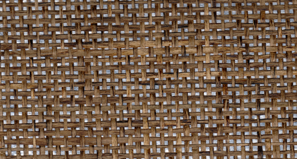
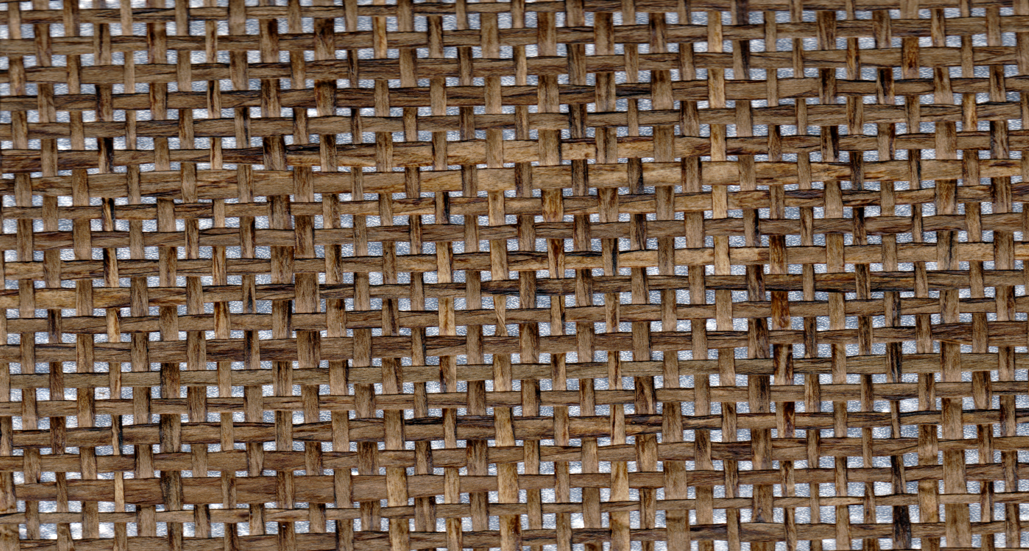
Lately I’ve been finding myself irresistibly drawn to texture. Frames, mats, it doesn’t matter. I can’t get enough of linen mats and their amazing wealth of minute detail. I think it’s the way you get such subtle variation in the way your eyes read the color of the mats. White is nubby or irregular with a ‘whiter’ white on the weft and shadow on the weave. Black has more interest when it’s textured than when it is simply the absence of color. All of a sudden it has even more depth.
The colors that are available in fabric mats are awe-inspiring. The grey silks are subtle and have a sheen so elegant it starts to mirror the colors in the art as the light changes in its environment. The red silks are so intensely saturated they achieve a vivid tone impossible to mimic in a paper application. There is a mat that looks like dark dye denim that I want to use on everything, and almost have. I’ve used it on pencil sketches, black and white photos and vividly colored art prints. It’s my equal opportunity offender and my customers couldn’t be happier. Without exception they all remarked that they never imagined choosing a mat that looked like that before I showed it to them.
Texture can take your dowdy neutrals into the world of spectacular. That said, I do tend to shy away from the more blatant color/texture combinations. There is an Astroturf mat that I’m sure has found its niche that still feels like an inside joke to me.
When it comes to frames, the ones closest to my heart right now are the ones whose profile has drama. I still love frames with fantastic wood veneers and sweet glossy lacquers, but it’s the shape of the profile that makes all the difference when dealing with your basic black, white or espresso finish.
A perennial favorite of mine is the dramatic cove profile. That sexy swoop falling down to the art in the center gets me every time. It’s a graphic statement that directs the eye with bold authority. The cube frame is saved from terminal boredom when the rabbit is deep and sculptural. The way the frame stands up, cradling the image feels like a floater frame application for glassed art. I love the extremes of big chunky frames on smaller pieces and delicate barely-there frames on large abundantly matted pieces. The vocabulary of scale is not often initiated by the average customer. Years of standard double mats with a 1- to 1½-inch frame have blinded customers to the infinite variation possible with true custom framing.
I’m also smitten with the new metal frames. The bold, tall narrowness with sharp squared edges is everything you want for a modern application. The colors are killer and completely current. Texture hasn’t been neglected in the frame design either. The frames that look like the face has been shaved down with a grinding tool make me drool with delight. The metal frames that have a gentle curve on the outside edge and a slightly angled face are appealing for completely opposite reasons. They have a soft, brushed finish and possess an oriental feel that is worlds apart from your dusty old bamboo moulding of days thankfully past.
Come to think of it, never let the dust settle in the first place. Don’t let the stagnation of the comfort zone keep you and your customers from experiencing the excitement of discovery. Play with color, texture, scale and proportion. Embrace change and let your creative juices flow. Life and framing are at their best when the unexpected opens your eyes causing you to see everything in a new way.