By Eric Jarmann
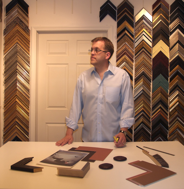
Photo credit – Michael Gabor.
Eric Jarmann, owner of Eric Jarmann & Company.
As framers, our framing design habits tend to be influenced by various trends that crop up in the world of art and decor. Sometimes you have a favorite frame profile for a long time, but then eventually you eventually drop it from your repertoire. We all have that group of corner samples that’s worn from constant use and relegated to the lower corner of the sample wall. We just stop seeing them as we once did.
Seeing Old Frames in a New Light
Sometimes it’s to pick up samples that you haven’t used in a long time and reacquaint yourself with them, almost like you might with an old friend. With a little attention, you might start to see the design in a new light. And perhaps those frames you lost interest in will be worth rediscovering and falling in love with all over again.
In this regular column, Attention to Detail, we are going to focus on various details of frame design. Each month we will select a design detail for close examination. We’ll start with a quick look at its history and origins. Then take a look at how we’ve used that design over the years, as well as what the market currently has to offer. By examining frame design details that we are already familiar with, we can gain an expanded perspective and refreshed appreciation of them.
Why pay attention to trends that are not currently popular? After all, trends come and go and what looked good ten years ago may seem tired-looking and overused right now. But give it another two years and it could become fresh and new all over again.
What Goes Around Comes Around
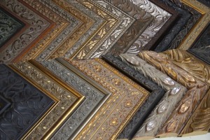
Staying in touch with an array of design details, regardless of their popularity, keeps us a strong player in the design game. Consider two such trends—the flat square profile and the ornate frame. At one point not too long ago, the flat profile was considered by some framers as somewhat of a compromise and a selection for the customer that couldn’t make up their mind or the customer that was afraid of picking something that had “too much style.” So they would default to something that was safe and easy which often meant the flat profile.
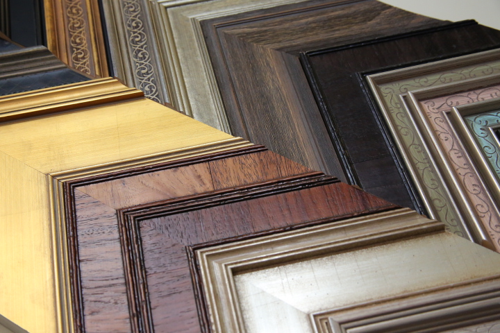
Current profiles with a flat panel.
Various manufacturers.
Photo credit Eric Jarmann.
But is simplicity always a compromise? Fast forward to 2012 and the situation was a bit different. When you opened an interior design magazine you saw almost nothing but flat square profiles, usually in white. Demand for flat frames increased in some markets to be a considerable percentage of sales. Some framers became frustrated at the lack of variety in the trend. But then change cropped up again. Open an interior design magazine this year, in 2014, and you will often see a single, highly ornate, eye-popping frame as the centerpiece of a room.
Ornate Influences
Why so ornate in 2014? Right now, Victorian clip art in the graphic art and printmaking fields is stirring interest in designs from the Industrial Age and the Victorian Era. As well, major museums are getting a fair amount of media coverage around the restoration of important paintings to be displayed in their original large-scale and extremely ornate frames. Simply put: people are being conditioned to like ornate frames once again. The domination of the market by the ornate frame may not be here today, but it could be on its way and soon. Are you ready? How familiar are you familiar with your design details?
As framers we know what we like about a particular frame. However what makes the framing customer pick a certain frame? Every frame has a range of elements and details that collectively make the profile what it is. In the eyes of the consumer there is often just one prominent feature that is foremost in its appeal and influences their choice of that profile. In reality, though, there may a dozen or more elements in the design that contribute to the success of that choice and to the pleasure in viewing the finished work.
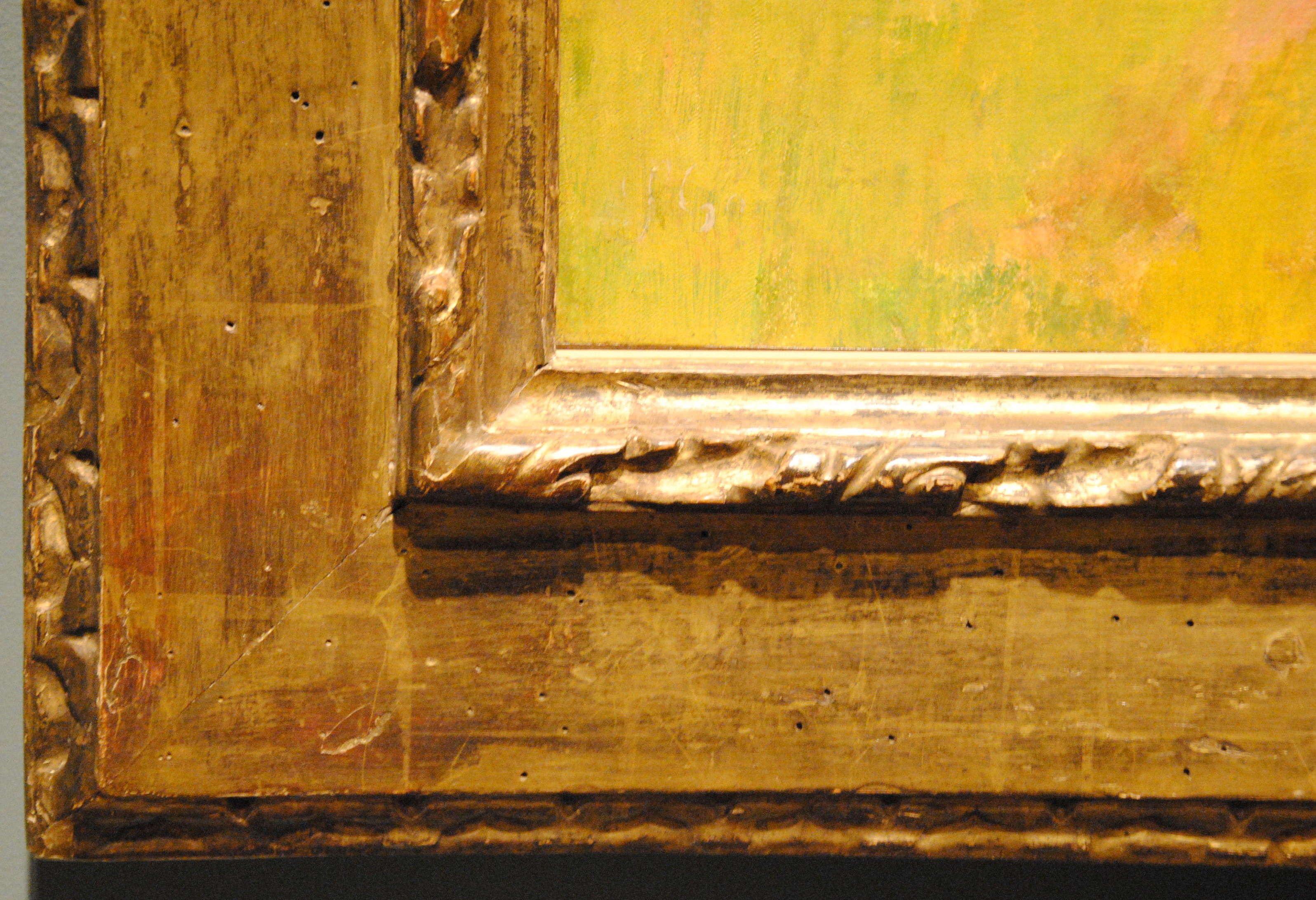
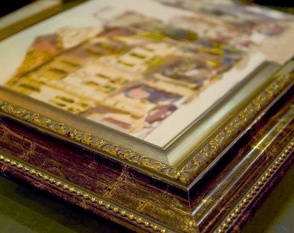
Antique frame with a flat panel.
Italian 16th century cassetta frame, National Gallery of Art, Washington, DC.
Photo credit Mathilde-Jeannine Durand.
Giving Frame Details Their Moment in the Spotlight
Its overall impression is the combined presentation—the shape, finish, width, ornament, proportions, patina, etc. These are all so important, even if they are more subtle or in the background. It’s like when you go to see a musician perform. They are the one in the spotlight and reason that you to bought a ticket, but what about the band? There are the drummer, keyboardist and the bass player. While not always in the spotlight, the band members certainly add to the experience and are a big part of why you enjoyed the entire performance. Fortunately, at some point during the performance, each member gets a chance to do a solo, taking the spotlight for the moment and showing us what they can do. In this column we are going to give each of the design details that make up a frame their deserved attention by giving them a solo, their moment in the spotlight.
Consider each of these articles as the start of a great conversation about design. And by all means, feel free to chime in and offer your own perspective. Share pictures of your work as an example of the design detail being considered. Tell us your favorite moulding in this design category. Is there a discontinued profile that you miss? Tell us what you liked best about it and someone might suggest a replacement option.
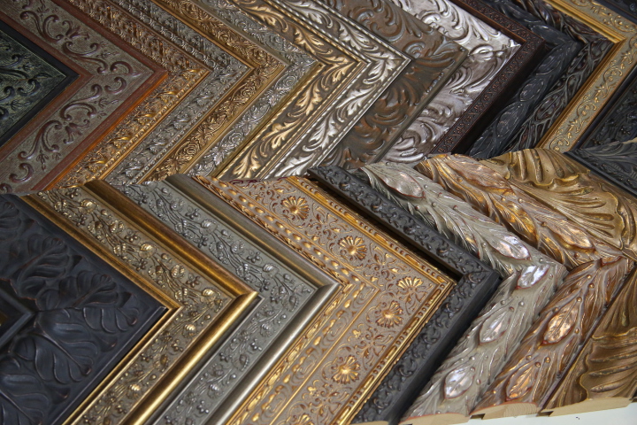
Current profiles with botanical ornament.
Various manufacturers.
Photo credit Eric Jarmann.
We have invited a wide variety of informed perspectives to our conversation in order to add depth to it. This includes the people that put the frames out into the world like the manufacturers, the custom frame shops and the frame makers. We will also get input from those who use frames in their own fields such as artists, interior designers, antique dealers, galleries and museums.
Ultimately, we hope each conversation will become an in-depth consideration of the design detail being featured and become a resource that you can turn to when in need of design inspiration and frame design confidence.
Eric Jarmann has been in the picture framing field since 1997 being the owner of John Haywood Gallery and of Eric Jarmann & Company. With background in retail management, gallery, photography, graphic design and restoration of old homes he brings a broad range of design and business skills to the picture framing industry. He is the in-house framer for Thornwillow Press and its boutiques located in the St. Regis Hotels. He also is founder of Newburgh Portfolio, a regional arts organization. He is active in social media and runs a blog about picture framing called All About the Frame. He can be reached at eric.jarmann@gmail.com.


Elwyn Crawford
9 April
Hard not to fall in love with some mouldings and sometimes when the new amour appears, the old love is temporarily put aside.
Mouldings are subjected to the same swings and roundabouts as fashion, but YES history shows that “What Goes Around Comes Around” nearly always returns the temporarily abandoned to a top ranking position once again.
Many interesting points to consider in this article.